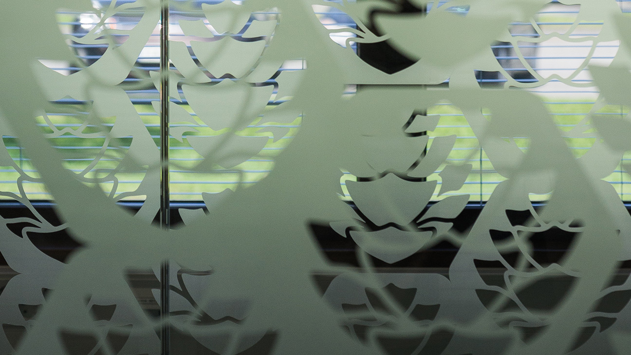
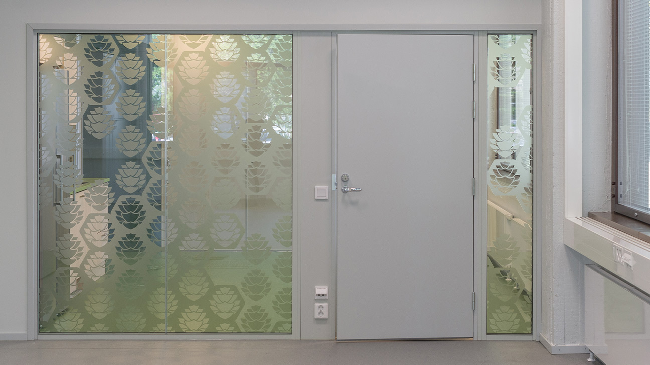
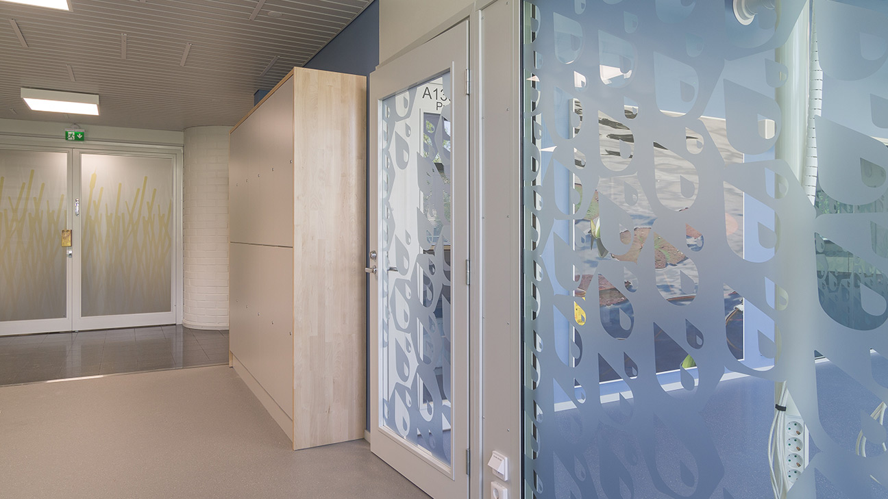
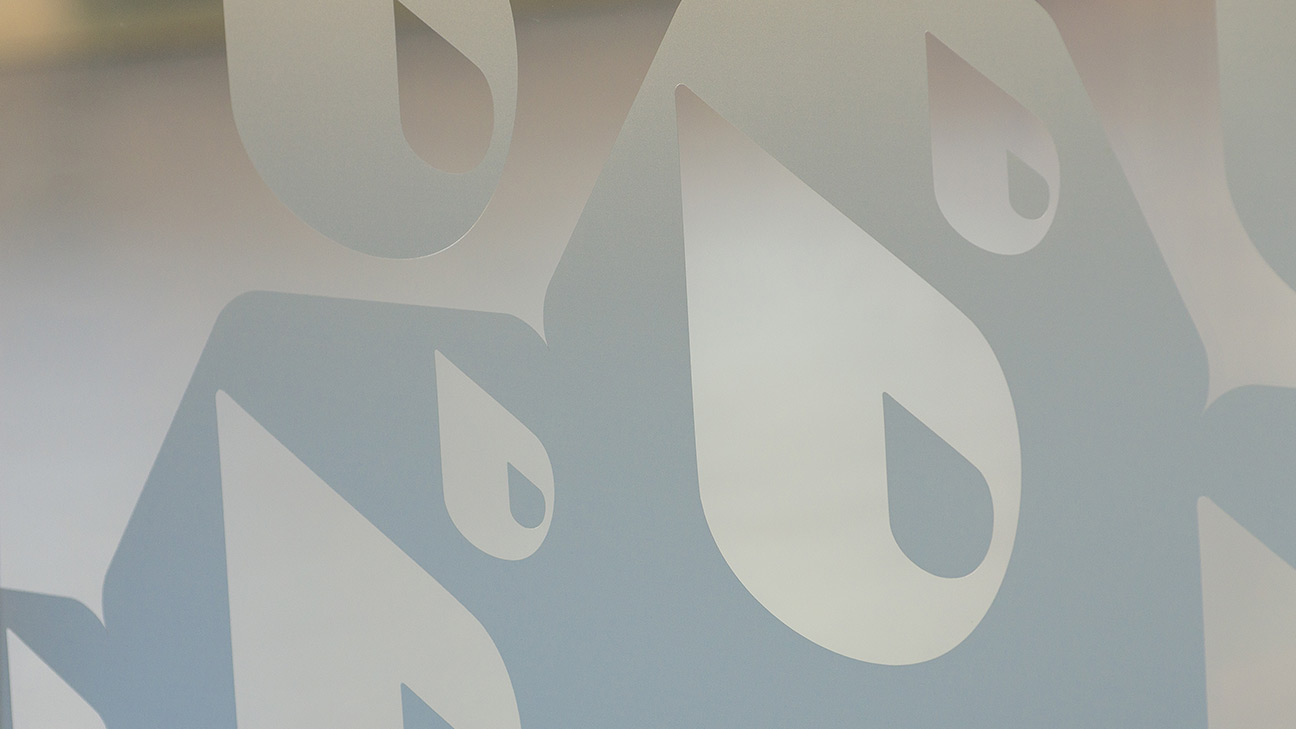
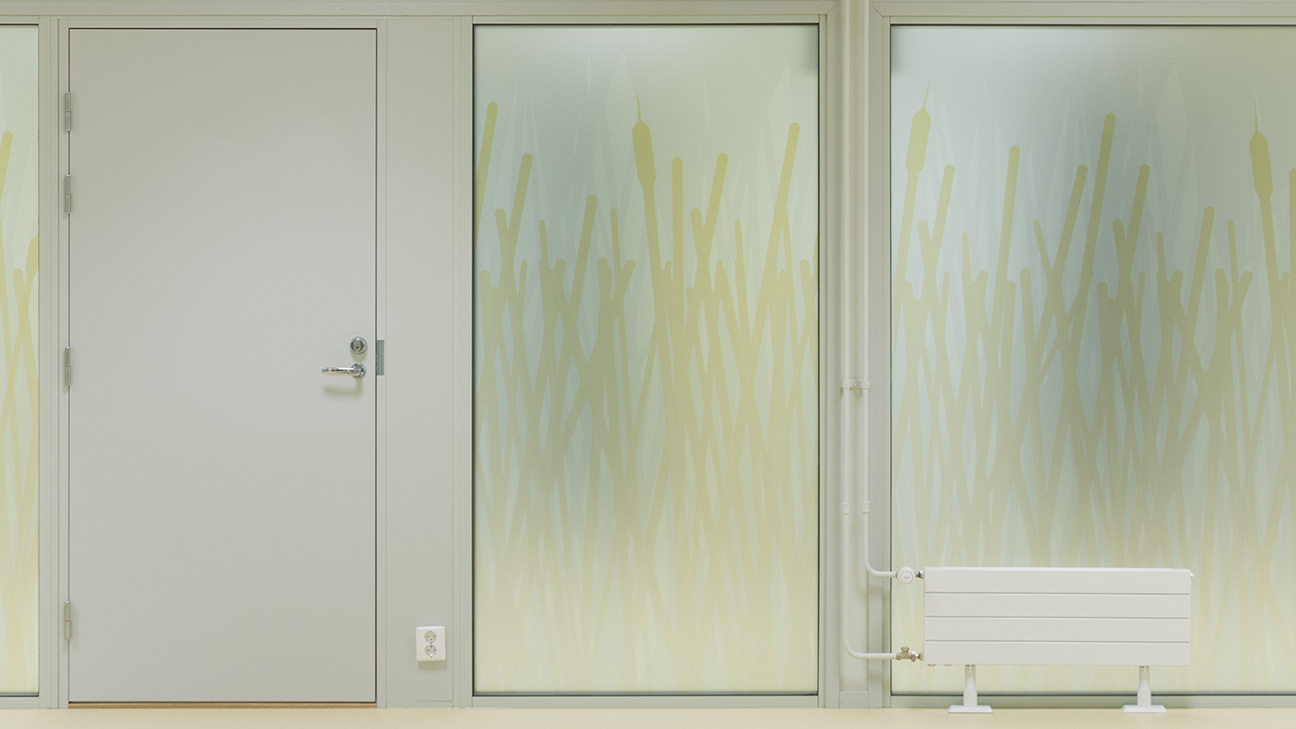
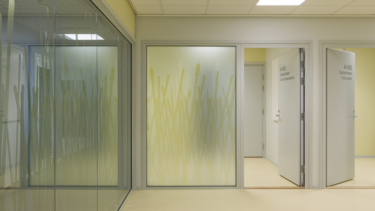
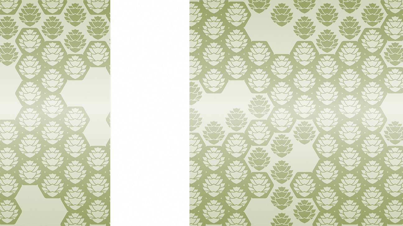
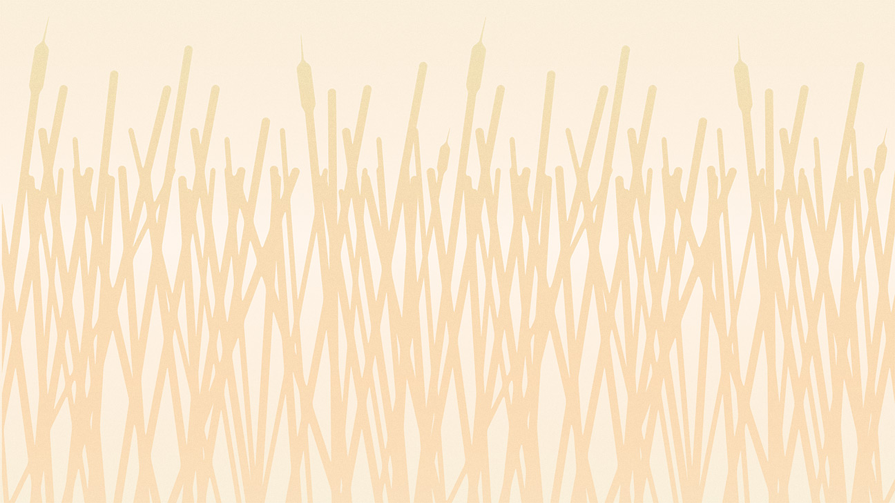
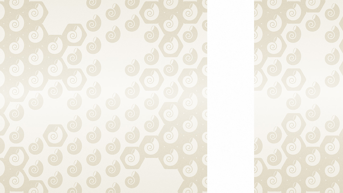
At UKI Arkkitehdit I was responsible for designing a glass graphics set for Pohjankartano School staff working quarters. In the area, there are four distinctive interior design styles that draw inspiration from Finnish nature and the glass graphics are designed to support the overall design.
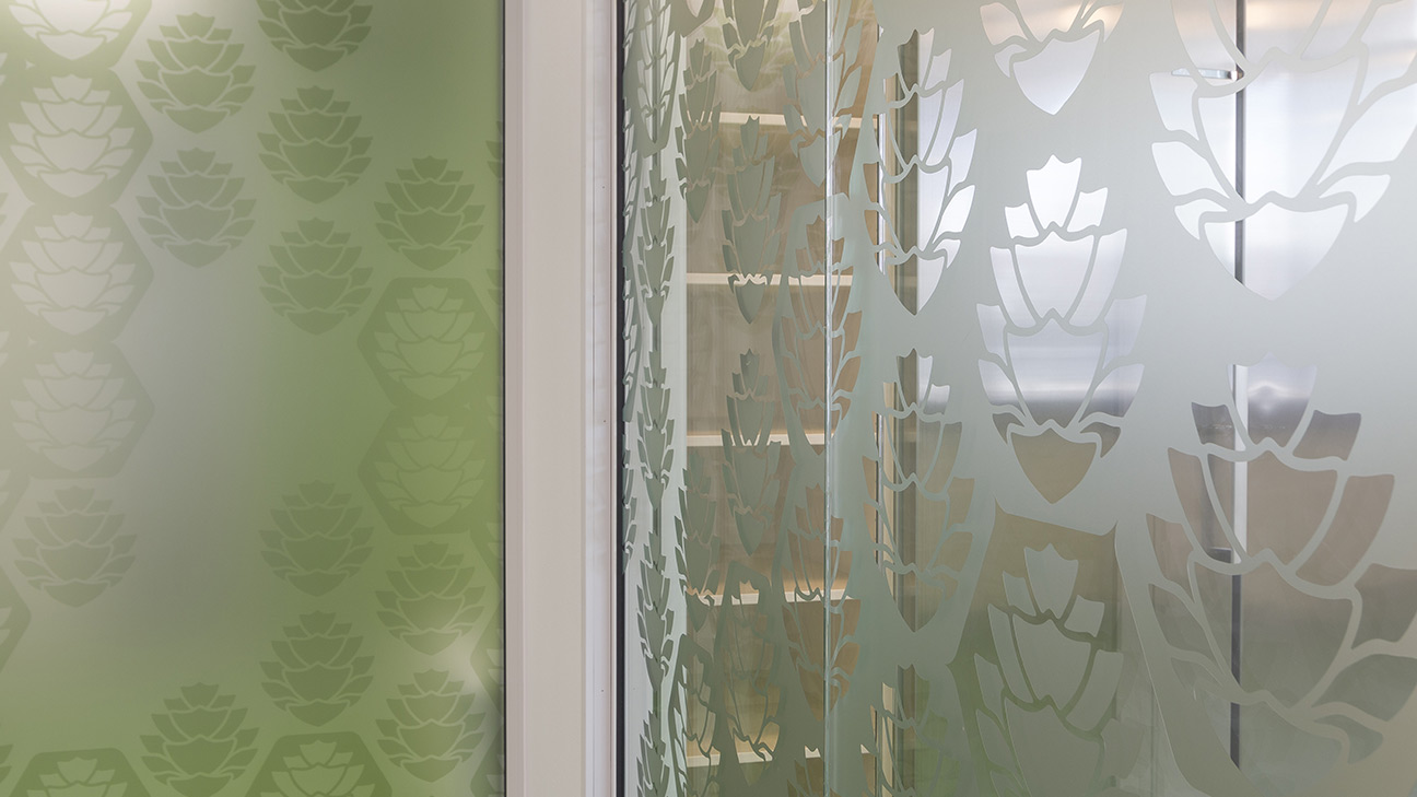
Design styles include Reed bank, forest, water and shore. Core spaces have yellowish colours and the reed graphics design which differs from the surrounding design with shape and colour. Graphics in the surrounding spaces follow a tight hexagonal pattern with a symbolic representation of the theme inside the hex. That way there’s a clear connection between the outer spaces and a distinction from the core work area.
Spaces needed a varying degree of visibility through spaces. Some needed to be completely blocked due to privacy requirements. This was achieved by printing the graphics and colours to matte vinyl and then cutting graphics in the spaces where visibility between spaces is wanted. Originally spaces which would need privacy consisted of interweaving graphics on both sides of the glass so both privacy and the play on glossiness was achieved. This design choice was stripped from the final plans to cut costs.
Pohjankartano School is originally designed by architect Kari Virta in 1967. School is undergoing a renovation which is being designed by UKI Arkkitehdit.
